
McCormick Flavor Maker
Through research-led feature design, a QR-powered in-store experience, and a personalization system that put 34K recipes on dinner tables in the first month.
Role
Lead Product Designer
Company
ArcTouch
Project Type
iOS · Android
Date
2019 / 2020
Contribution
Feature Design · UX Research · App Clip · CMS
The Problem
A 130-year-old brand,
building a digital habit
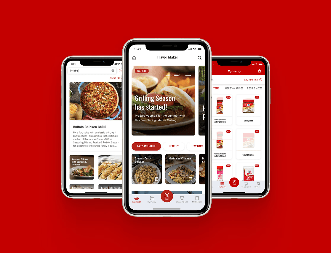
McCormick & Company is a global leader in flavor — 130 years of spices, seasonings, and condiments in kitchens around the world. The Flavor Maker app was their bet on digital: a mobile product that started as a barcode scanner to identify McCormick spices on store shelves, and gradually evolved into a full cooking companion with a 12,000-recipe database, pantry management, meal planning, and a shopping list.
ArcTouch was brought in to push the product further — identifying the features that would turn occasional users into people who came back every day. I joined as the sole designer on the project, eventually leading a second designer as the engagement expanded.
My role
Solo designer, then design lead
Solo designer - Year 1 (2019)
Owned the full design surface end-to-end — discovery, UX, UI, prototyping, user testing, and handoff. Worked directly with the McCormick product team and ArcTouch engineering, bridging between client goals and buildable design decisions.
Lead designer - Year 2 (2020)
Onboarded and led a second designer as project scope expanded. Responsible for design direction, quality review, and aligning both tracks of work — while continuing to own the most complex feature areas directly.
Who we were designing for
Three types of cooks, two distinct needs
McCormick's internal research team provided three user personas based on their broader consumer research. These weren't hypothetical archetypes — they were behavioral profiles drawn from real usage data and user interviews. They shaped every prioritization decision across the project.
→ Skews toward parents, busy households
Get dinner on the table. Every night.
Plans ahead, shops at one store
Cooks most nights of the week
Only uses what's already on the list
Wants to please the family, not impress anyone
→ Skews older, higher skill level
Get inspired throughout the week.
Plans, but lives in the moment
Shops at multiple stores
Loves a cooking challenge
Visits the app throughout the week
→ Skews millennial, weekend cooks
Seek out new flavors. Impress.
No planning, fully spontaneous
Visits the app from within the store
Shops anywhere
Seeks to impress with new recipes

Design implication: The Functionally Driven user — the most common profile — needed speed and reliability above everything. The Creatively Driven user needed inspiration the moment they picked up a spice. Both goals had to coexist in the same app.
Feature design
The project goal was clear: increase retention and engagement with the McCormick brand through the app. Every feature we designed had to answer the question — does this bring users back, or does it just add capability?
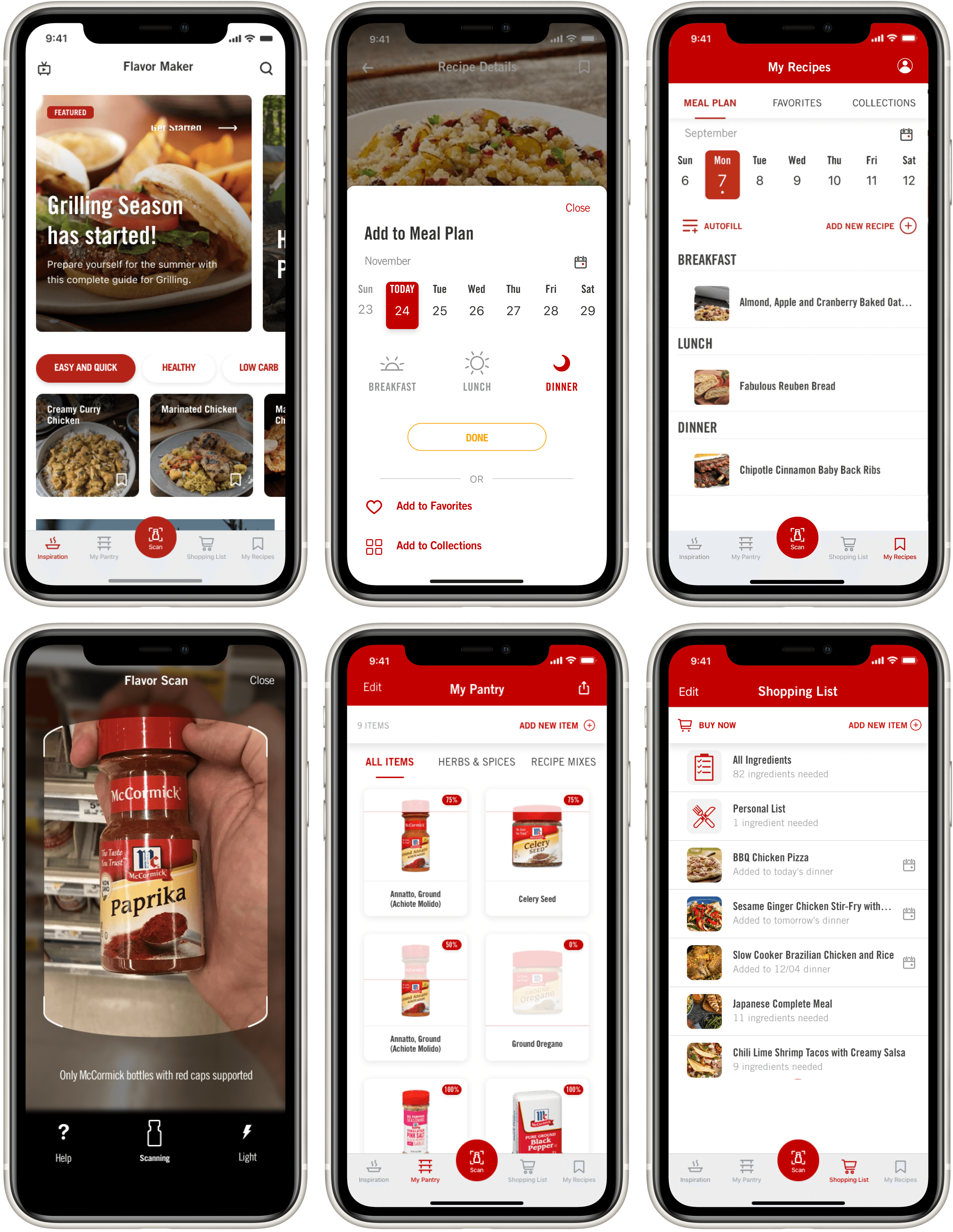
Personalized weekly planning from a 12,000-recipe database
The Meal Planner let users browse from McCormick's 12,000-recipe database and save meals to a weekly calendar. Personal preferences powered tailored recommendations, and push notifications reminded users when it was time to start cooking. It was the app's first meaningful retention hook — a reason to come back not just when browsing, but on a schedule.


Built on Meal Plan — designed for the time-poor, dinner-only cook
Meal Plan solved the general use case. But user testing and interview data revealed a sharper unmet need: users with busy routines who could only realistically cook dinner — and needed to plan and shop for the whole week at once, fast.
These users weren't spending Sunday afternoon leisurely filling in a weekly calendar. They had 5 minutes, needed to plan 5–7 dinners, and had to know what to buy before the grocery run. The original Meal Plan required too many steps per recipe and offered no way to batch-plan the week.
Composite from user testing & McCormick research data · Functionally Driven user

The design principle: Don't make a busy parent think. Give them 7 good options, show them what they need to decide, and get out of the way. The fewer taps between "open app" and "week is planned," the more likely they come back next week.
Cooking inspiration triggered by QR code, directly on the store shelf
The Creatively Driven user visits the app from within the store — that insight from McCormick's research pointed to an opportunity to meet them exactly there. The App Clip experience used Apple's App Clip technology triggered by a QR code on McCormick aisle campaigns — no download required.
Users scan the QR code, land instantly on a flavor and cuisine browsing experience, and explore recipes based on the spices in front of them. If they want to save a recipe, the App Clip prompts them to download the full app and create an account — converting in-store browsing into a registered user in the product funnel.

McCormick aisle campaign materials carry QR codes that launch the App Clip instantly — no app download, no friction between shelf and inspiration.
Users explore recipes by flavor profile and cuisine — directly connected to the spices they're holding. Designed for the spontaneous, in-store shopper.
Saving a recipe requires downloading Flavor Maker and creating an account — turning an anonymous in-store moment into a registered, retained user.
Aisle inspration storyboard (hand-drawn, no AI)


CMS-driven content system — no new builds for every campaign
A quarterly goal for the project was making the app's Inspiration screen responsive to McCormick's marketing calendar without requiring a new development build for every campaign. Seasonal moments — grilling season, the holidays, Taco Tuesday — were high-value windows for engagement, and McCormick needed to act on them at marketing speed, not engineering speed.
The solution was a CMS-backed component system for the Inspiration screen: a set of modular, configurable content blocks — header carousel, featured content cards, quick search tags, and personalized "For You" recommendations — that McCormick's content team could configure, reorder, and publish independently. A/B test support was built in from the start, so the team could experiment with layouts and content without developer involvement.

Fixed top component, resized for better hierarchy. CMS-configurable per page: title, description, thumbnail or video, content link type. Auto-rotation. Each slide managed as an independent entry.
High-visibility placement below the carousel. Focused on themes, cuisines, or seasonal events — Taco Tuesday, Holidays, Grilling Season. Single or multi-card variants, each tapping through to a curated collection page.
Inline recipe search tags driven by CMS — most viewed recipes in the last 30 days, seasonal events, or content team priorities. Improved recipe discoverability without requiring users to open the full search flow.
Personalized row of 10 recommended recipes powered by Meal Plan preferences and usage data. The more a user engaged with the planner, the more relevant their Inspiration feed became.

Process
Research-in, metrics-out
Every feature in the project started from the same place: real user behavior data from McCormick's research team and usability findings from our own testing. The process was iterative by design — we tested hypotheses early, incorporated feedback into the next cycle, and used the outcomes to inform what came next.
01 | Persona alignment
Reviewed McCormick's three user personas and behavioral research to understand the distinct use cases. Set design priorities based on the largest user segment (Functionally Driven) without neglecting the Creatively Driven user who represented the highest acquisition opportunity.
02 | Feature discovery
Identified feature opportunities from McCormick's usage data and internal research. Prioritized based on potential retention impact: Meal Plan and Dinners for the Week targeted daily return; App Clip targeted acquisition; CMS targeted marketing velocity.
03 | UX & prototyping
Designed user flows, wireframes, and interactive prototypes for each feature. Dinners for the Week went through multiple flow iterations before reaching the batch-planning model — earlier versions still required too many taps per recipe.
04 | User testing
Ran usability testing sessions on key features. Dinners for the Week was validated with target users — the batch-select model, day toggle, and recipe preview card all came from direct test feedback. Results shared with McCormick's product team before finalizing.
05 | UI & handoff
Delivered production-ready UI in McCormick's brand system — annotated specs, component states, interaction notes, and platform-specific behaviors for iOS and Android. Worked closely with ArcTouch development through QA and launch.
06 | Post-launch iteration
Monitored post-launch metrics with McCormick's data team. The +34K recipes scheduled in month one and 64K daily users validated the Meal Plan and Dinners features. Session time increase (+12min) confirmed the Inspiration screen changes were driving deeper engagement.