Intermex
Money transfers across US & LATAM
Money transfers across US & LATAM
Redesigning a high-stakes fintech app for Latin American immigrants where every friction point doesn't just frustrate, it destroys trust.
Role
UX/UI Designer
Company
ArcTouch
Platform
iOS | Android
Team
2 Designers
Date
2023
Contribution
End-to-end Product Design

Context
One of the most trusted names in
US-to-LATAM remittances
One of the most trusted names in
US-to-LATAM remittances
Intermex (International Money Express) is a leading money transfer service for Latin American immigrants living in the United States — covering 62 countries, processing billions in annual transfers, and offering cash pickup at over 180,000 locations. In 2025, the service was acquired by Western Union.
I joined ArcTouch as one of two designers to lead a full redesign of the Intermex mobile experience across iOS and Android — rebuilding a product already in market with an established user base and billions in transaction volume.

My role & Contribution
Design from the ground up to development of the mobile app, focused on iOS users
Discovery for the main features, design system foundations, user flows and handoff prototypes
Intermex core features: account creation and banking connection, money transfers, support & notifications
Focus on low tech-savvy users, and supporting a wide range of devices
Support and troubleshooing on connecting an tracking transfers from US to Mexico bank accounts
The Problem
This wasn't an aesthetic problem.
It was a trust problem.
Intermex's users are predominantly Latin American immigrants with low digital literacy — often sending money to family members for the first time through a mobile app. For this audience, every friction point in the flow doesn't just create frustration. It creates distrust. And distrust at this scale means abandoned transfers and family members waiting.
Regulatory compliance
Regulatory compliance
KYC and banking regulations couldn't be simplified away. Every verification step was legally mandated.
Technical complexity
Technical complexity
Bank connections and identity verification are inherently multi-step, high-stakes processes.
Low digital literacy
Low digital literacy
First-time mobile app users — many unfamiliar with KYC processes or digital banking concepts.
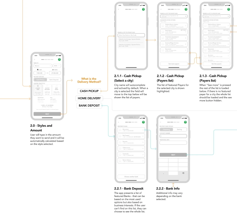
The core tension: We couldn't make the flow simpler — compliance wouldn't allow it. We had to make complexity feel manageable. That required a completely different design strategy.
Design Approach
The hardest call:
don't fight the complexity
The natural instinct was to simplify. But KYC, WIRE transfers and Local banking integration flows can't be simplified — they are legally defined. Instead of designing against the constraints, we designed with them: making each step feel intentional, safe, and human.
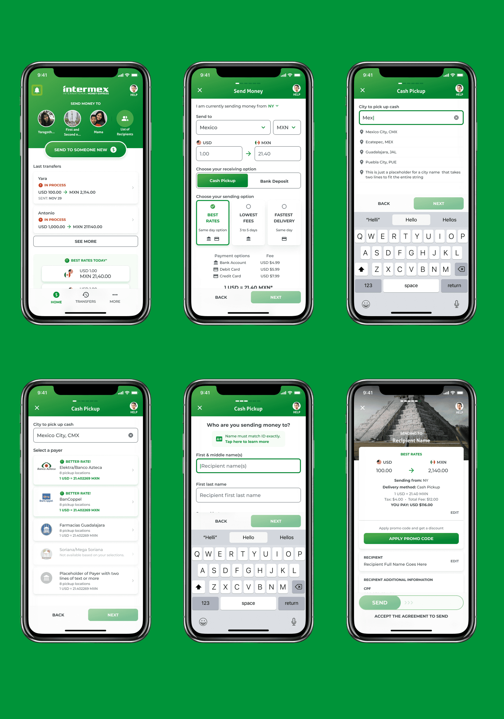
The principle: if a user understands why they're doing something, they'll complete it. If they don't, they'll abandon. For every data request in the KYC flow, we rewrote the microcopy to explain the reason. For every long form, we added honest progress signaling. For every intimidating step, we added context that made it feel standard rather than suspicious.
Process
From discovery to Figma handoff
01 | Discovery & Research
Competitor analysis of Remitly, WorldRemit, and Western Union. User interviews with first-generation immigrants to understand mental models around money transfers and digital trust.
02 | User Flows & Wireframes
Mapped end-to-end flows for account creation, KYC, bank linking, and transfer. Flows built with flexible components and auto-layout — used as live collaboration artifact in stakeholder reviews.
03 | Design System
Built a lightweight cross-platform system grounded in native iOS and Android patterns. Text inputs, list items, cards, and buttons — no custom components where platform patterns sufficed.
04 | KYC & Trust Layer
Redesigned information hierarchy and microcopy for the verification flow. Added progress signaling, contextual explanations, and error recovery states. Turned legal requirements into trust moments.
05 | Accessibility
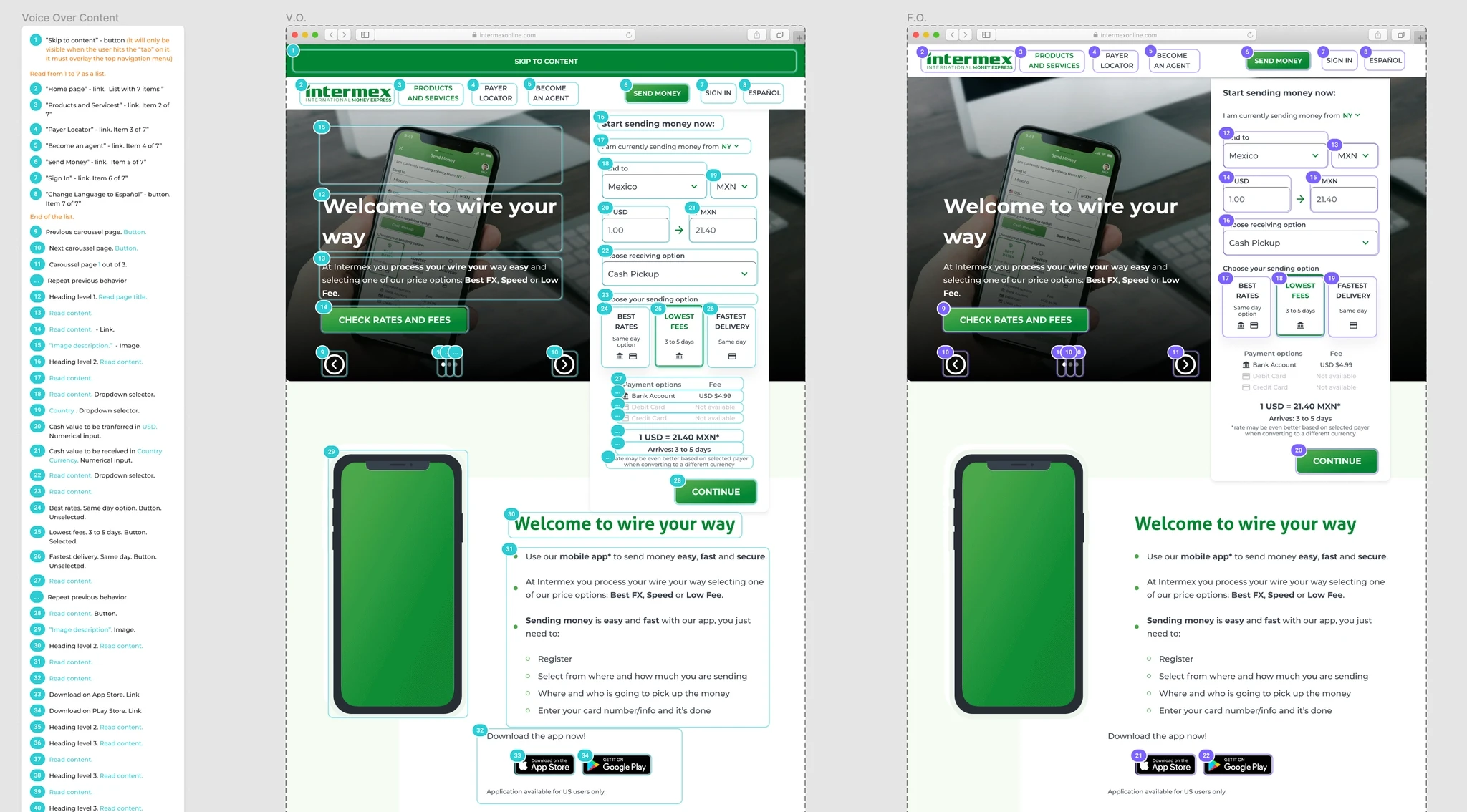
WCAG-compliant guidelines for VoiceOver, Focus Order, and 200% text scaling. All components, colors, and inputs validated before handoff.
06 | Handoff
Full handoff documentation — annotated specs, component states, interaction notes, and platform-specific behavior for both iOS and Android development teams.

Design System
Native-first, platform-aware
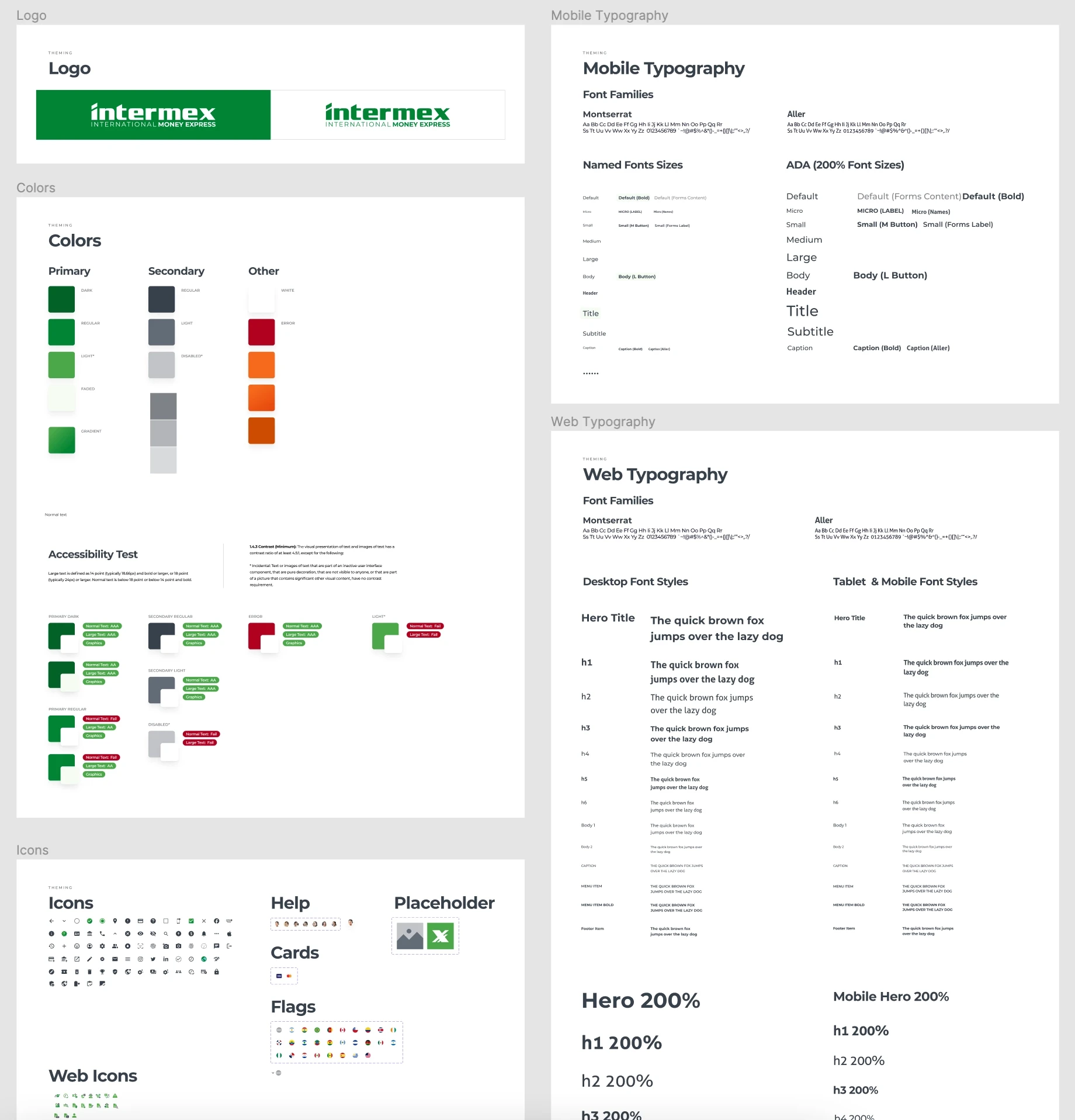
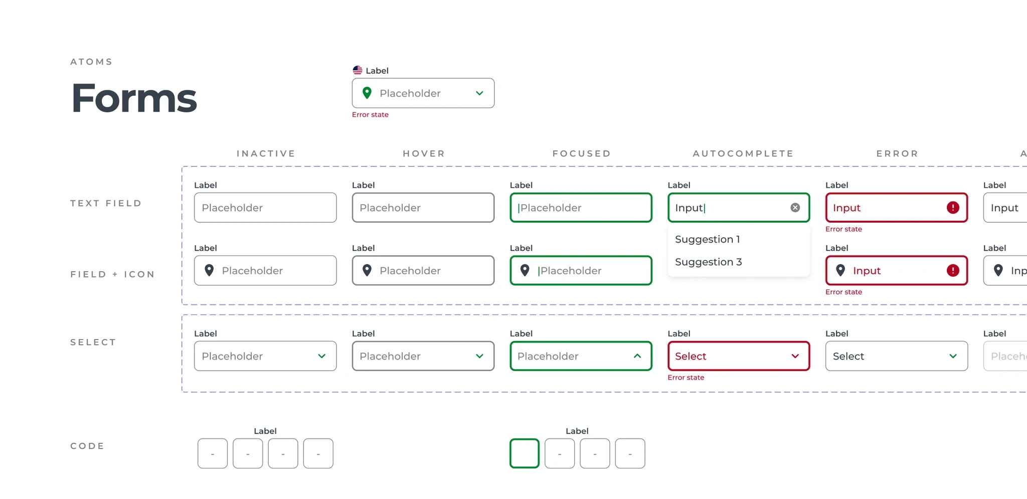
The system was intentionally lightweight. No custom components where native patterns existed. The UI vocabulary — text inputs, list items, simple cards, and buttons — mapped directly to iOS and Android conventions. Familiar to users, and dramatically reduced development overhead.
Accessibility
Designed for the widest range of users
The target user base spans older adults, users with low vision, and people unfamiliar with digital products. Accessibility was a direct product quality requirement for this audience — not a compliance checkbox.
Deliverables
What shipped
End-to-end mobile redesign
End-to-end mobile redesign
iOS and Android — account creation, KYC, bank connection, money transfer, notifications
Cross-platform design system
Cross-platform design system
Native-pattern-first component library, shared across iOS, Android, and web
WCAG accessibility guidelines
WCAG accessibility guidelines
VoiceOver, focus order, 200% text scaling — all components validated
Outcome
The redesign shipped.
The rating held.
The redesigned app ships and maintains a 4.8★ App Store rating across 25,000+ reviews. For a fintech product serving a high-trust, high-stakes use case, maintaining that rating through a full redesign is the signal that the experience landed.

4.8⭐️
4.8⭐️
On app Store,
from +25k reviews
62
62
Countries wiht secure
wire transfers
180k+
180k+
Cash pickup locations worldwide
Key learning
The goal isn't always to simplify,
it's to make complexity feel manageable.
That distinction matters especially in fintech, where regulatory constraints are real and user trust is everything. Designing for compliance doesn't mean designing against the user — it means finding the layer where clarity, safety, and progress signaling can do the work that simplification can't.
LinkHere
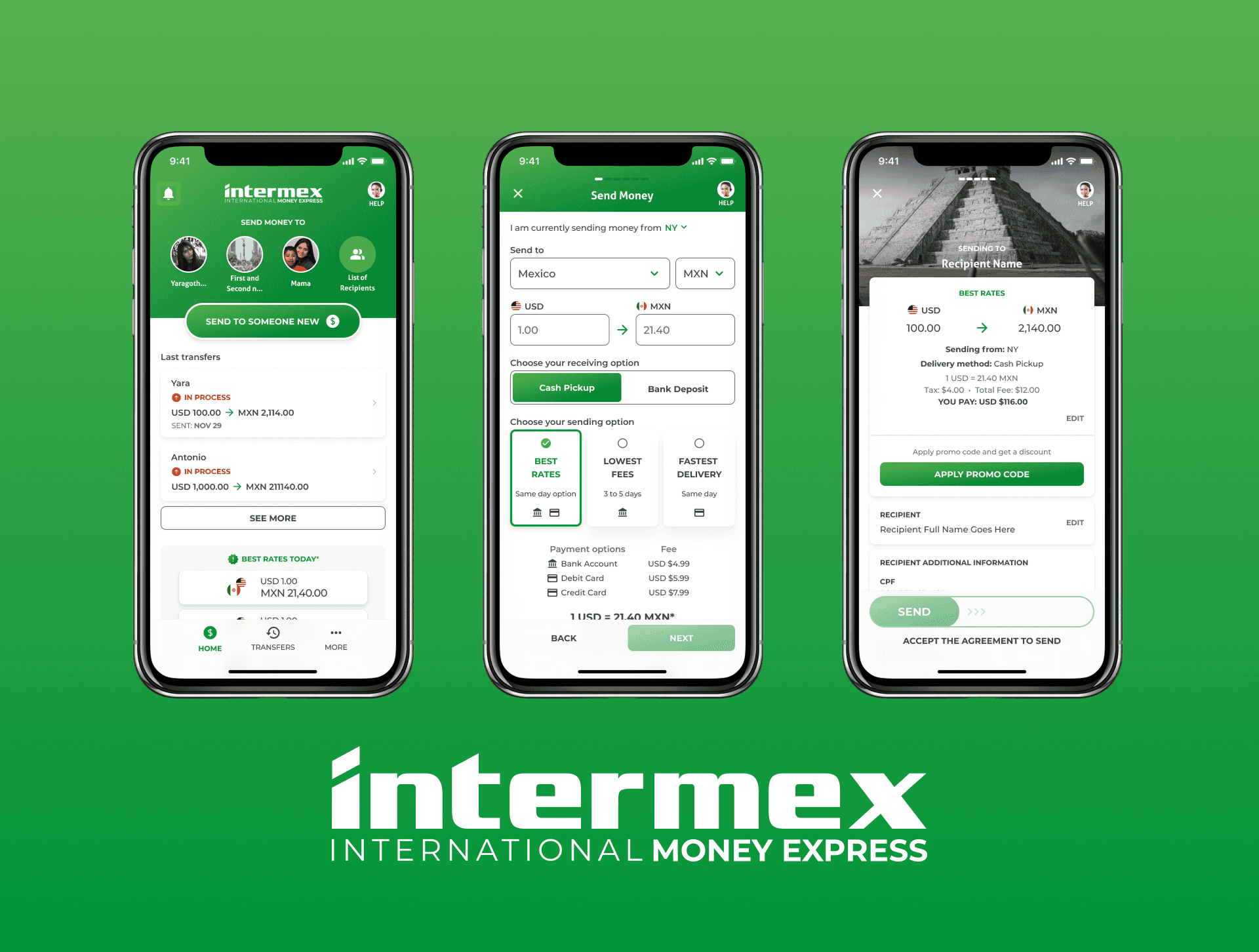
Intermex (International Money Express) is a popular service for international money transfers, especially focused on Latin America, allowing for fast and secure transfers and mobile phone top-ups. It offers cash pickup at over 180,000 locations and was acquired by Western Union in 2025.
Design from the ground up to development of the mobile app, focused on iOS users. Competitors research
Discovery for the main features, design system foundations, user flows and handoff prototypes
Intermex core features: account creation and banking connection, money transfers, support & notifications
Focus on low tech-savvy users, and supporting a wide range of devices
Support and troubleshooing on connecting an tracking transfers from US to Mexico bank accounts
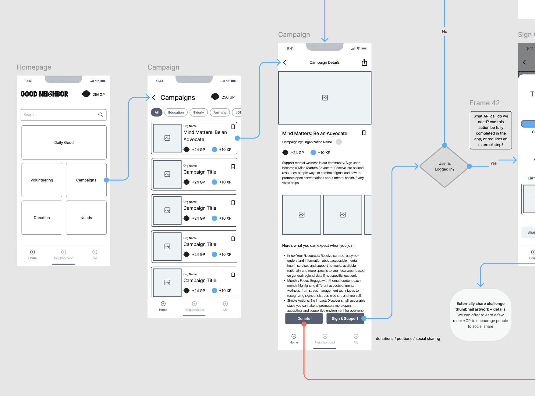
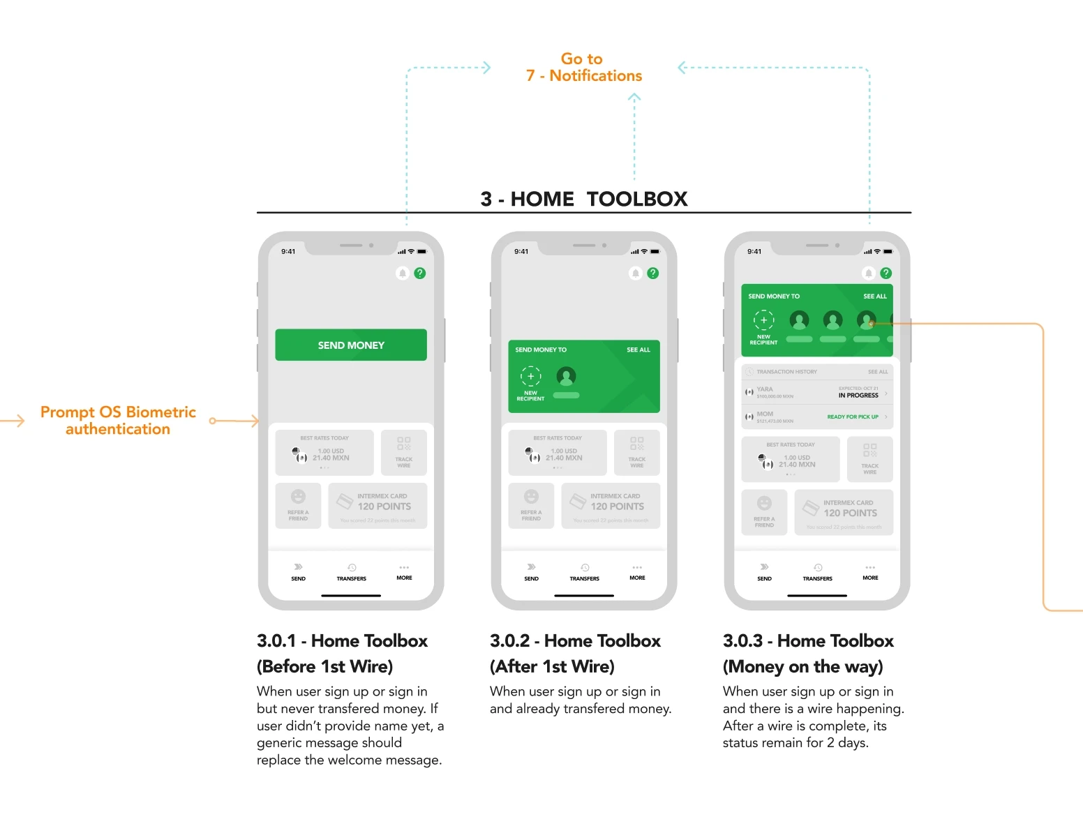
The user flows had multiple functions: in the Figma file, we built the screen with flexible components and auto-layout. That same flow was shared across the team and stakeholders in meetings for feedback and discussion, and after defining the final UX/UI we handoff to the development team all within Figma.
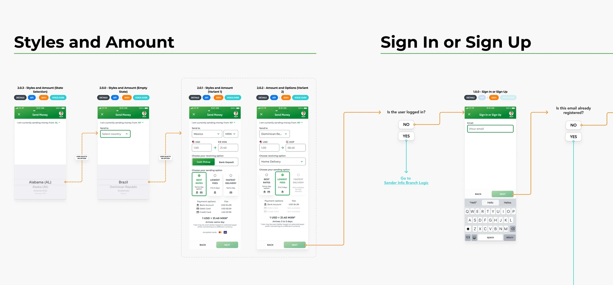
This is a lightweight but solid design system: The UI is based on text inputs, list items, simple cards, and buttons, mostly without images, so we could build it simple and effectively using most of the native patterns for each platform (Web, iOS and Android), making easier our work and saving lots of development time.
The goal of the project was to make money transfers easier and more accessible, so we also build guidelines for accessibility for the app and web experiences, based on the standards from WCAG and industry patterns for VoiceOver, Focus Order, and Scaling, making sure that all components, text, colors, and inputs match those requirements.